😀😀😀😀😀😀😀😀😀😀😀😀😀😀😀😀😀😀😀😀😀😀😀😀😀😀😀😀😀😀😀😀😀😀😀😀😀😀😀😀😀😀😀😀😀😀😀😀😀😀😀😀😀😀😀😀😀😀😀😀😀😀
Ingrid Burrington is a New York-based artist who began her career with data visualization. Ingrid Burrington's webpage takes a minimalist approach. Her pages are text-only, but visitors can click on hyperlinks hidden within the text to explore the content of her work. There is a brief introduction to Ingrid Burrington, a writer and artist who also makes maps, tells jokes, and makes political art on the homepage. Her site looks very clean and straightforward, but each hyperlink is distinguished from the normal text by a mint green color. When I first visited her site, I didn't even realize she was an artist because the style is so simple and looks like it was created when the internet was not so advanced. Hidden behind these minimal words, its thought-provoking content. After clicking on different hyperlinks, her page is very rich in content and consists of countless hyperlinks. Her work is more like a way to deliver messages and influence people in a light-hearted way.
😀😀😀😀😀😀😀😀😀😀😀😀😀😀😀😀😀😀😀😀😀😀😀😀😀😀😀😀😀😀😀😀😀😀😀😀😀😀😀😀😀😀😀😀😀😀😀😀😀😀😀😀😀😀😀😀😀😀😀😀😀😀
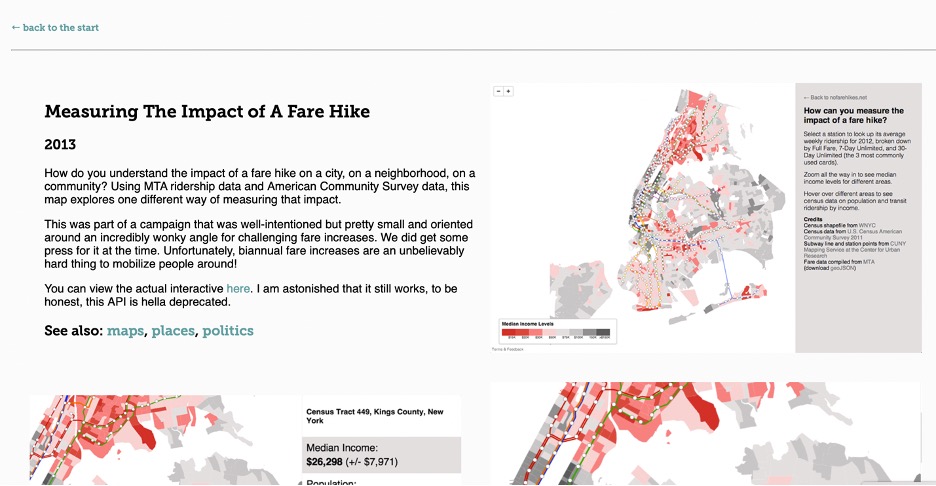
Data visualization is a simple and intuitive way for people to understand information. I have always believed that a picture is worth a thousand words, so I enjoy looking at data visualization in my life and my work. Ingrid Burrington specializes in data visualization to present some maps, and the topics of her maps are also fascinating. Measuring The Impact of A Fare Hike is an interactive map created in 2013. A guide about the data and where the data come from are on the right side of the map. I think this provides good information for viewers to start because it is difficult to understand the data genres if there is no guide. This map uses rich MTA data and survey data to show the impact of fare increases on people. I can zoom in and zoom out on this map to see the data details and overall visualization. When I zoom in on the whole map, the map doesn't seem to work properly because I can only see a few dots. The entire map consists of two main parts. The first part is the median income, population, and amount commuting using public transit for different areas of New York. When I mouse over an area, this information is displayed on the right side of the screen, and there is a pie chart to show transit ridership by income. Ingrid Burrington chose to make pie charts with different values in orange to differentiate the different incomes nicely. By continuing to zoom in, you can see the specific average income for each region on the map without having to place your mouse over the location of an area. Different colors distinguish median income levels, the lowest being red and the highest being dark gray. Therefore, the whole map is mainly composed of red and gray for different values. I think it's exciting that even though I don't know the income levels of New Yorkers, I can still quickly tell which areas have high and which areas have low income. I can even make guesses about housing prices. The second part of the map is made up of subway lines and stations. When the mouse is placed on a subway station, information about the station and the profit increase will appear. What is very shocking is that I never thought that the rise in ticket prices would bring so much extra revenue. There is a lot of data on the whole map, but there is no confusion. Just the right color also makes the entire map look very harmonious.
 Ingrid Burrington:Fare Hike
😀😀😀😀😀😀😀😀😀😀😀😀😀😀😀😀😀😀😀😀😀😀😀😀😀😀😀😀😀😀😀😀😀😀😀😀😀😀😀😀😀😀😀😀😀😀😀😀😀😀😀😀😀😀😀😀😀😀😀😀😀😀
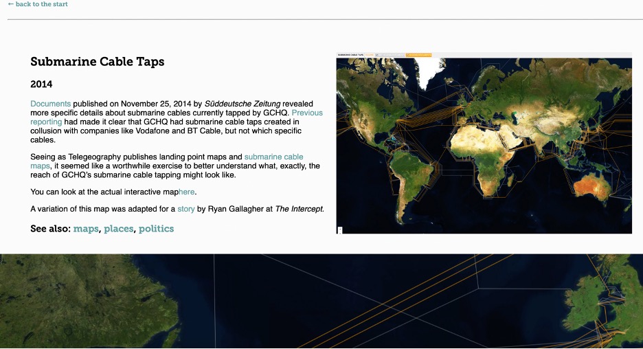
Submarine Cable Taps is also an interactive map related to political issues created in 2014. There is more information on hyperlinks about data on this work information page. The whole map is a world map. The map is very realistic because it simulates land, sea, and mountains. The dark blue ocean and green-dominated green areas make the orange submarine cable taps lines very attractive to the eye. As I kept zooming in on the map, I could even see each river. Unlike the previous map, I need to click on different lines to get information instead of placing the mouse directly on the lines. The information form contains the name, owners, and associated GCHQ programs of Submarine Cable Taps. On the information page, there is a hyperlink about the submarine cables data tapped by GCHQ. Also, we can see where all the data comes from on the information page. This interactive map has a similar form as Measuring The Impact of A Fare Hike; they both related to the region information. However, Submarine Cable Taps is less interactive and has less information about the impact on the map. Measuring The Impact of A Fare Hike tells more economic impact, and I think the data is more direct. I think both maps represent some political and economic stances and visually provide information and data for viewers.
 Ingrid Burrington:Submarine Cable
😀😀😀😀😀😀😀😀😀😀😀😀😀😀😀😀😀😀😀😀😀😀😀😀😀😀😀😀😀😀😀😀😀😀😀😀😀😀😀😀😀😀😀😀😀😀😀😀😀😀😀😀😀😀😀😀😀😀😀😀😀😀
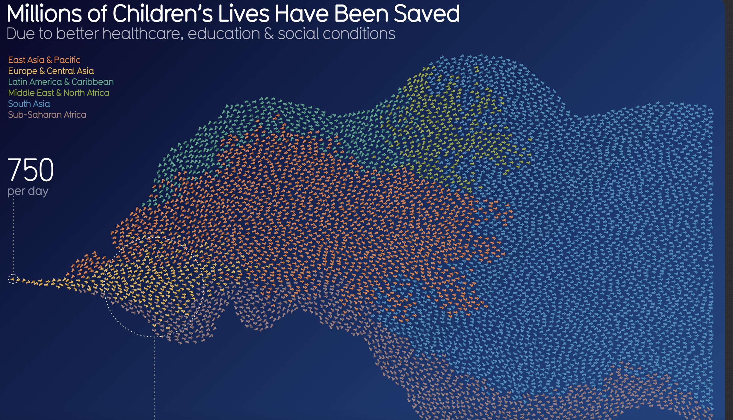
David McCandless is a London-based writer, artist, and designer who also creates data visualization art. His web page has a similar style as Ingrid Burrington, which only has text and hyperlinks. His webpage is like storytelling from himself and shows what he is doing currently. Information is beautiful is one website of a bunch of data visualization works. He creates more than 600 visualizations for many topics. Millions of Children's Lives Have Been Saved is a colorful and unjoyful data visualization created due to healthcare, education, and social conditions. The artist uses a different number of same children figures with different colors to visualize the number of children that have been saved. David McCandless uses Tangerine Red as East Asia & Pacific region; orange as Europe & Central Asia region; Cyan as Latin America & Caribbean region; green as Middle East & North Africa region; blue as South Asia region; pink as Sub-Saharan Africa region. At the bottom of this visualization is the primary reasons why children are saved; this visualization is more concise and childlike than Ingrid Burrington's data visualization because of the theme. His work is not interactive, but Ingrid's work is more interactive. Both of their work tells a lot of information and related to political issues. They both stand for society's stances and care for the economy and the society. Their data visualizations provide viewers with data and information in addition to economic information and metaphors about the city and culture that viewers can learn from their data.
 Millions of Children's Lives Have Been Saved